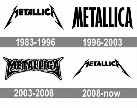
Metallica……….they’re the biggest band in the world and for good reason. They’re one of those bands that evolved and didn’t pigeonhole themselves like other bands. I’ve always been curious about their artwork/logo so let’s take a look……
Up first, we’re taking a look at the actual Metallica logo. I didn’t realize that they have really only had four logos. The original logo was designed by James Hetfield in 1983 and he designed the legs on the letters M and A to be extended and have that sharp hook and 3D look. This one lasted all the way from 1983-1996 to which they had it condensed with a more minimalist look. Then in 2003-2008 the logo got that flame look and personally, I find it to be kind of dated. It was used during the St. Anger era (2003-2008). In 2008-now, they brought back the old logo from 1983 but with a slight change. The band name is slightly smaller with as well as having the letters M and A being more slanted. However, you feel about Metallica you cannot deny how bad ass their logo and the Pushead artwork is.
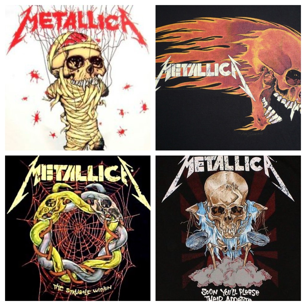
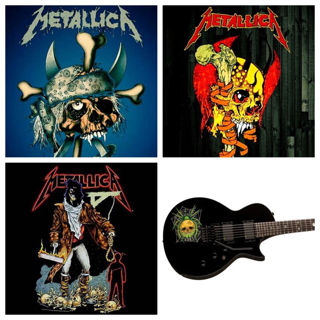
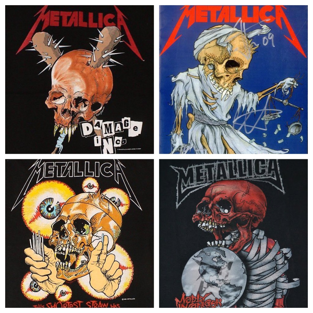
Next up are the skull logos. The first one that stood out to me was the skull artwork on the t-shirt for “One.” You know that white shirt with the skull on the front with the lyrics on the back. Anyway, the skull logos that appear on many of their merch, posters, etc were designed by an artist named Brian Schroeder aka Pushead. He actually formed the band Septic Death but once that band broke up, he focused on artwork for bands. Besides Metallica, he’s also done artwork for bands like Kylesa, Monster Voodoo Machine, Prong, Hirax, and even Travis Barker. When asked why he only draws skulls, he said “because that’s what everybody wants.” I love the fact that Metallica still uses Pushead’s artwork and ESP guitars even rereleased one of Kirk’s signature models with the spider graphic on it.
 Sinister Reviews